A good pin is built around one accurate promise, on a 2:3 canvas, readable at the size people actually see it. Start with the destination and the visual evidence, pick a layout that matches the communication job, then check it at feed size before it goes anywhere.
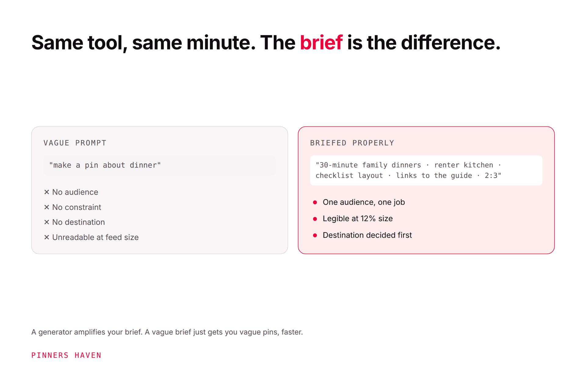
Here's the thing that catches almost everyone: a busy pin usually started as a vague brief. People open a design tool, pick an attractive template, and then try to work out what to say inside it. That's backwards, and it's why so many technically pretty pins get no clicks.
Decide the promise first. The design follows.
Write one sentence before you open anything:
This pin helps [specific reader] get [specific result] by showing [evidence].
"Pantry ideas" leaves you guessing. "A measured layout for a narrow rental pantry" immediately tells you: floor-plan visual, compact headline, destination with dimensions in it.
And the page has to deliver the same thing. Don't design a dramatic before-and-after when the article contains generic tips, that gap is where trust goes, and it converts a click into a bounce.
Pinterest's distribution guidance recommends high-quality vertical creative and identifies 2:3 as the useful aspect ratio. The common canvas is 1000×1500 pixels.
Adobe Express's Pinterest pin maker starts from that same 1000×1500 template, as do Canva's Pinterest presets. Export requirements and supported animation or video formats change, so check current specs before a big production run.
One obvious subject or result. Product, room, recipe, diagram, person — it has to still make sense when the image is narrow and small.
A short, specific promise. Break lines by meaning, not wherever the text box happens to wrap. This one detail separates amateur pins from professional ones more reliably than font choice.
One useful qualifier: "with measurements," "under 30 minutes," "five storage zones," "tested on mobile." Only when the page actually proves it.
Restrained logo, URL, type family, or colour treatment. Brand recognition matters. A watermark covering the subject does not.
5. Destination context
Prepare the title, description, board, link, and disclosure alongside the graphic, not afterwards. Pinterest's creation guide recommends reviewing design and details before publishing.
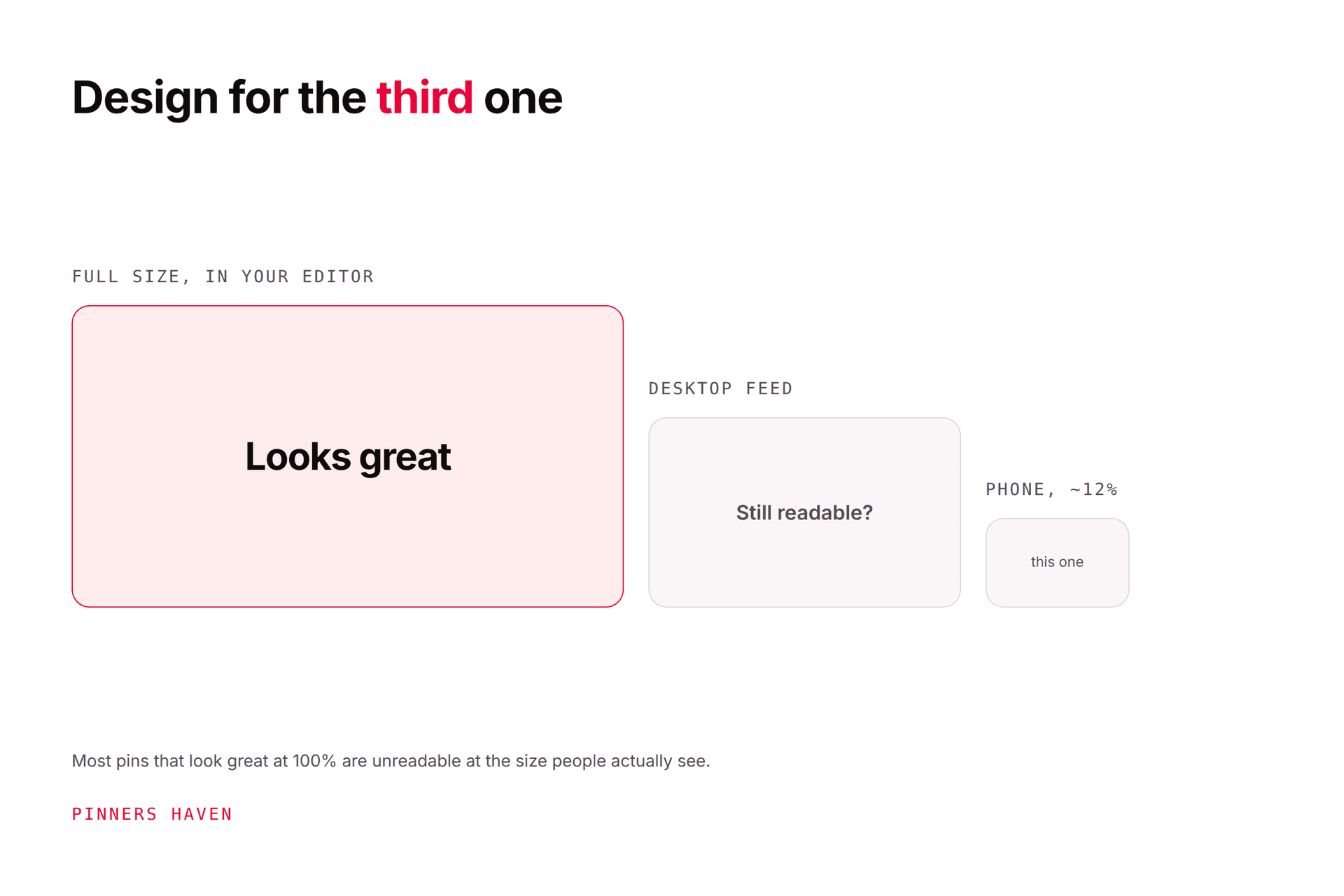
Zoom your preview down until it's the size of a pin in a real feed. Then ask:
Can you read the main promise without leaning in?
Is there one obvious focal point?
Does the text cover the evidence it's describing?
Is the contrast strong enough?
Would the image still make sense without the small details?
Does the linked page show the promised answer immediately?
If it fails, remove something. The instinct is to add — a bigger logo, another line, an arrow. The fix is almost always subtraction.
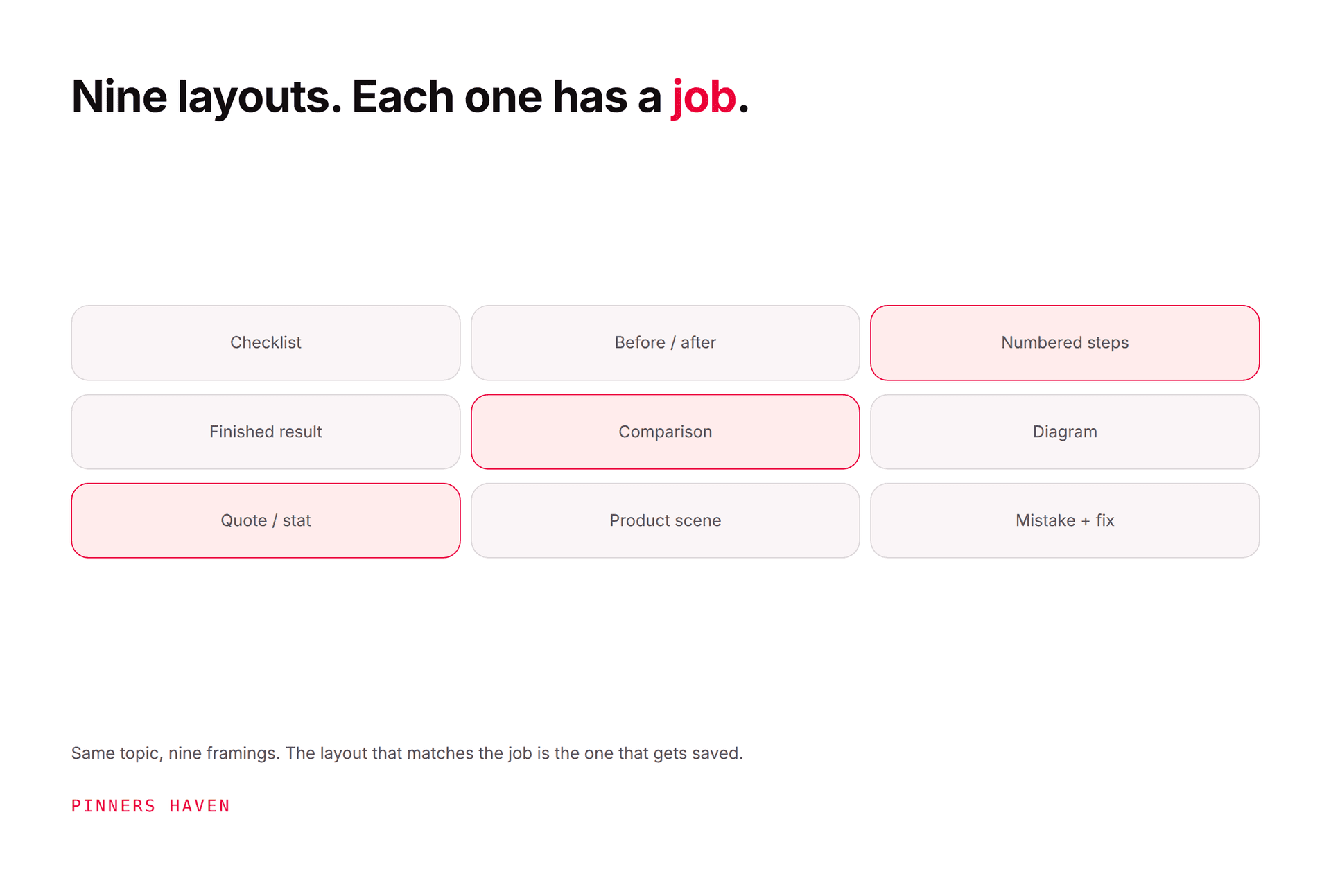
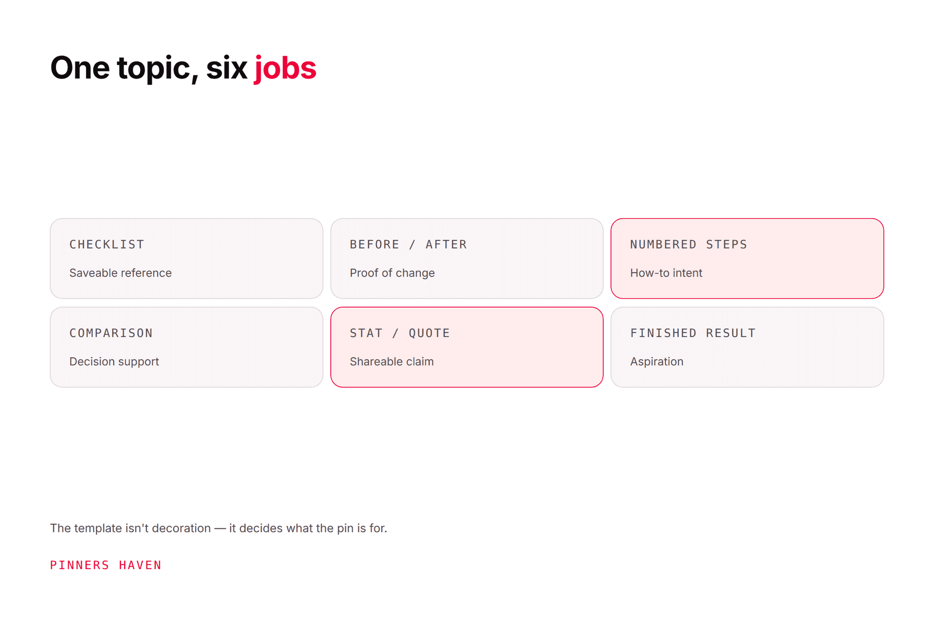
Using one layout for all six jobs is the most common reason a feed of pins looks professional and performs badly. See 50 pin design ideas for more structures.
Generated images invent hands, text, product details, ingredients, rooms, and outcomes — confidently.
Never use a generated image as proof of a real result. Confirm rights and labelling requirements, and compare every product representation against what you actually ship. Pinterest applies labels when its systems or supplied metadata indicate AI modification; our AI Modified guide covers the disclosure system.
The workable pattern is AI inside a designed structure: a human-made layout and type system, with generated imagery filling a defined slot. That's the difference between a branded pin and the generic AI look readers now recognise instantly.
There's a second failure mode, and it arrives later.
You build a template that works. You reuse it because it works. Somewhere around the eighth or tenth use it quietly stops working — reach decays gradually rather than dropping, so you don't notice, and you publish another thirty pins on a spent design before you do.
That's what the Freshness Meter in Pinners Haven tracks: wear per template, with each design auto-retired after roughly 5–10 uses and a fresh one rotated in before the hit lands. The rest of the system runs the process above — a layout matched to the angle, a human-designed template underneath with the generated photo colour-matched to it, an SEO title and three to five unique descriptions, and your approval before anything publishes.
The judgment in this article — what the promise is, whether the page delivers it — stays yours.
→ See how it works
(Disclosure: we make Pinners Haven. We're not affiliated with Pinterest.)
choosing a template before defining the promise
squeezing a blog title onto the image unchanged
four fonts, or several competing focal points
pale text over a busy photograph
making the logo the largest element
presenting an AI mockup as a real result
exporting without checking spelling and crop
publishing the same layout and promise repeatedly
linking a product pin to a generic homepage
2:3 vertical, commonly 1000×1500 pixels, for standard image pins. Taller ratios can be cropped in feed. Confirm current requirements for video and other formats separately.
Yes. Canva and Adobe Express both have free tiers with Pinterest presets, and both are genuinely sufficient. Check the licence terms for any stock or generated assets before commercial use.
Should every pin include text?
No. A strong product shot, photograph, or illustration can communicate on its own. Add text when it makes the task or the value easier to understand, not by default.
No. A pin is not an image licence. Use your own material or assets covered by a licence permitting your intended commercial use. This catches people out constantly and it's the one with real legal consequences.
More than you think. A single template starts losing effectiveness after roughly 5–10 uses, so a library of a few layouts across your different communication jobs will serve you far better than one polished template used forever.
Indirectly. Pinterest recommends high-quality vertical creative, and engagement signals like saves and clicks influence distribution, so a design that earns clicks helps. Design alone won't rescue a weak topic or destination. See the algorithm guide.
Decide what the reader should understand in one glance. Keep the evidence for it. Cut everything competing with it.
That's the whole method, and it's why the briefing sentence at the top of this article matters more than any tool you use to execute it.