50 Pin Design Ideas With a Job for Every Layout
The best pin design isn't the prettiest template in the folder. It's the layout that makes one useful promise obvious on a phone.
Joe Nyambura
Founder & operator, Pinners Haven · August 18, 2026
On this page15 sections
- Result-first layouts
- Tutorial and process layouts
- List and checklist layouts
- Comparison layouts
- Product and ecommerce layouts
- Proof and authority layouts
- How to choose among the 50
- Turn layouts into a visual test
- The problem with picking one favourite
- Design mistakes across every layout
- Frequently asked questions
- Which Pin design gets the most clicks?
- How many words should appear on a Pin?
- Should every Pin include a logo?
- Can I reuse a layout?
The best pin design isn't the prettiest template in the folder. It's the layout that makes one useful promise obvious on a phone.
Most people choose a template because they like it, then try to fit their idea inside it. That's backwards, and it's why so many technically attractive pins get saved and never clicked — the design is doing a different job from the content.
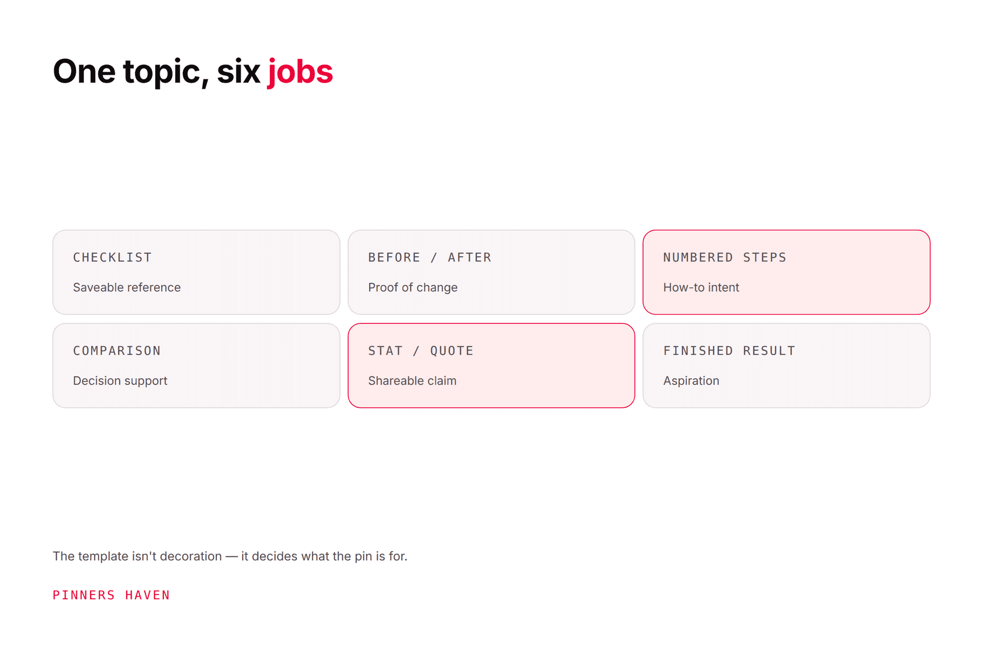
So choose the information job first: does the reader want a result, a process, a list, a comparison, a product, or proof? Then fit the photograph, headline, evidence, and brand cue around it.
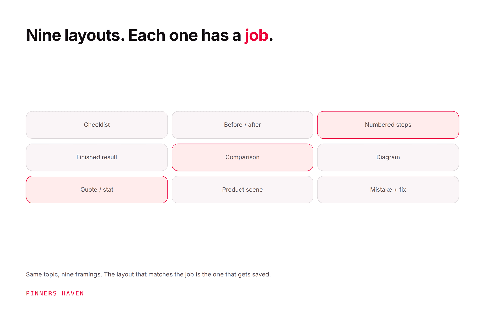
The 50 below are layout briefs, sorted by job.
Result-first layouts
These designs sell the finished outcome. Use real or licensed evidence.
Full-bleed reveal: One strong finished image with a narrow headline band.
Framed result: A clean border separates the image from a short title and logo.
Before and after: Matching camera angle and honest conditions on a balanced split.
Detail crop: One close-up proves texture, finish, technique, or craftsmanship.
Wide scene stack: Two related crops show the whole result and one useful detail.
Result plus dimensions: The finished space or object includes a few readable measurements.
Result plus constraint: A small label names the real limit, such as rental-safe or 30 minutes.
Color-story strip: A finished image sits above five sampled colors used in the project.
Tutorial and process layouts
Use these when the destination contains complete instructions.
Three-step vertical: Three equal frames show beginning, middle, and result.
Numbered photo path: A dominant image with three numbered callouts.
Hands-at-work: Original process photo with one action-led headline.
Tool and result: Required materials at the top, finished outcome below.
Annotated screenshot: One interface view with arrows pointing to the exact controls.
Flowchart Pin: A simple decision path for choosing the next step.
Recipe sequence: Ingredient, process, and finished dish in a vertical stack.
Mistake and correction: Wrong approach and corrected approach shown at the same scale.
Timeline strip: A process arranged by day, week, or project stage.
Exploded diagram: Parts are separated and labeled before assembly.
List and checklist layouts
Keep the on-Pin list short. The page should add examples, evidence, or the full resource.
Five-item checklist: One photo plus five concise actions.
Number-led list: A large number anchors the design beside the topic.
Icon checklist: Consistent icons label concrete categories, not decoration.
Do and don't: Two columns with direct visual examples.
Packing grid: Objects arranged in a neat flat lay with labels.
Materials card: A short supply list beside the finished project.
Weekly planner: Seven cells show a genuine sequence or schedule.
Decision matrix: Four choices compared across two useful criteria.
Printable preview: A partial, readable view of the downloadable asset.
Save-for-later reference: One compact chart that remains useful on a board.
Comparison layouts
Use consistent scale, lighting, labels, and criteria.
A versus B split: Two options, one decision, and one differentiator.
Three-option row: Good, better, and different-fit choices without a fake winner.
Feature matrix: A tiny table limited to the four facts readers need first.
Price-context card: Current price plus what the buyer receives, dated and sourced.
Size comparison: Products or objects shown against the same reference.
Material comparison: Close-up textures with care or use differences.
Method comparison: Two processes lead to visibly different outcomes.
Old versus updated: Show a real revision and state what changed.
Product and ecommerce layouts
Accuracy beats atmosphere when money is involved.
Clean product hero: Product, one verified benefit, price only if current.
In-use scene: Show scale and context without hiding the item.
Variant lineup: Real colors or sizes displayed consistently.
Bundle breakdown: Every included item labeled clearly.
Gift-recipient card: Product plus a specific, truthful recipient and occasion.
Problem-solution product: The real problem is shown beside the item in use.
Material detail: Macro photograph plus composition or care fact.
Collection story: Three coordinated products within one use case.
Proof and authority layouts
Do not invent results to fill these templates.
Single-stat Pin: One sourced number, date, and plain-language implication.
Mini chart: A readable trend with labeled axes and source.
Test result: Setup, result, and limitation summarized in three blocks.
Quote card with context: A short authorized quote, speaker, and source.
Case-study snapshot: Before metric, action, after metric, and time period.
Myth and fact: One claim corrected with a primary-source statement.
How to choose among the 50
Ask four questions:
What does the reader want to know or do?
What evidence do we actually own?
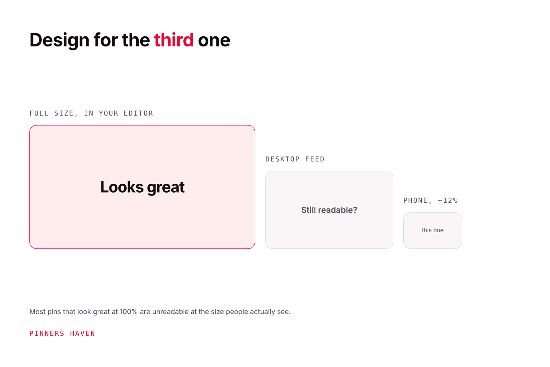
What must remain readable in the feed?
What extra value waits on the destination?
If the reader wants instructions, a glamour photograph alone will disappoint. If the reader wants inspiration, a dense checklist can smother the visual.
Pinterest's Pin distribution guidance recommends original vertical creative, accurate context, useful links, and relevant boards. Its creation guide tells creators to review the design and Pin details before publishing.
Turn layouts into a visual test
Choose one destination and test two layouts with different communication jobs. For example, compare a finished result with an annotated diagram, not the same layout in blue and green.
Record:
concept and layout
image source and rights
headline and board
publish date
impressions, saves, Pin clicks, and outbound clicks
site engagement or conversion
Pinterest Analytics distinguishes those actions. Let the business goal choose the winning metric.
Our pin design method guide covers the five-layer build and the mobile squint test, and the template briefs give niche starting points.
The problem with picking one favourite
Once you find a layout that works, the temptation is to use it for everything. That's the second failure mode, and it arrives quietly: a template stays effective for roughly 5–10 uses before reuse starts costing you reach, and the decline is gradual enough that you won't notice for weeks.
So the practical answer is a rotation — several layouts across your different communication jobs, retired and refreshed rather than run into the ground.
That's what the Freshness Meter in Pinners Haven automates: it tracks wear per template, retires each design after roughly 5–10 uses, and rotates a fresh one in before reach takes the hit. Each pin is built on a human-designed template with the generated image colour-matched to it, so the output stays branded rather than reading as generic AI.
(Disclosure: we make Pinners Haven. We're not affiliated with Pinterest.)
Design mistakes across every layout
shrinking six ideas into one unreadable Pin
using stock imagery unrelated to the destination
covering the result with the headline
placing pale text over a busy image
changing the layout but not the idea
showing prices, products, or results that are no longer true
using unlicensed images
treating impressions as proof of clicks or sales
Pinterest's Community Guidelines prohibit deceptive, irrelevant, repetitive, and manipulative content.
Frequently asked questions
Which Pin design gets the most clicks?
There is no universal winner. Test layouts against comparable topics and destinations, then compare outbound clicks and post-click behavior.
How many words should appear on a Pin?
Use the fewest words needed to state one clear promise at mobile size. The right count depends on type size, layout, image detail, and language.
Should every Pin include a logo?
No. A small brand cue can help recognition, but it should not compete with the subject or promise.
Can I reuse a layout?
Yes. Reuse a system while changing the concept, evidence, image, headline, and destination fit. Avoid a profile full of near-identical output.